Glover Earthmoving
Unearthing a new brand
Glover is a family-owned business based in the Wimmera region, who provide earthmoving services for farming, civil engineering or building purposes
The brief
Recognising the need for branding in this current day and age (and with family ties to get the job done), they engaged Refresh Your Brand to design a brand identity.
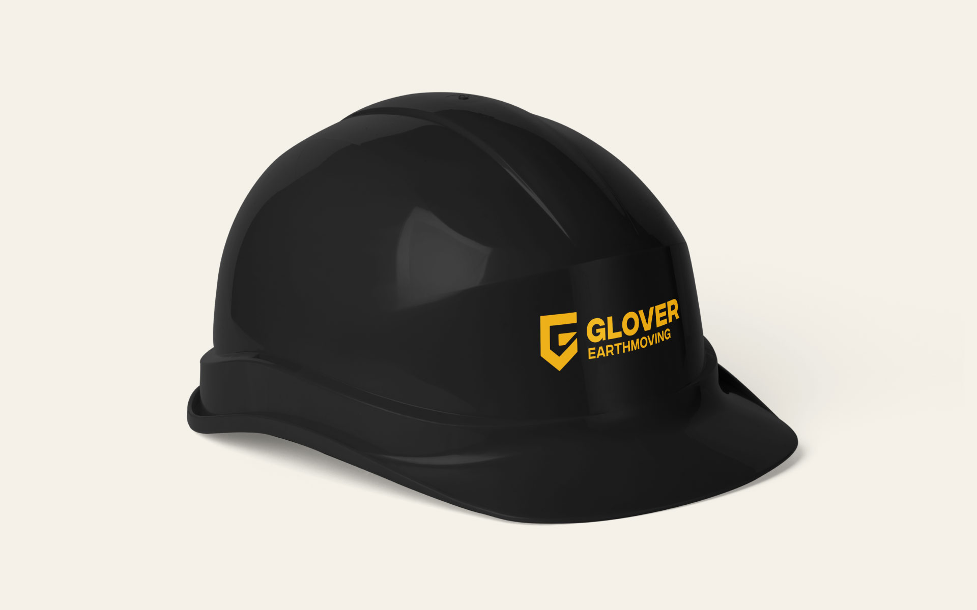
Glover work in a tough, competitive industry and required a logo that was simple, bold and tough that could be applied to a range of equipment, clothing and a website.

The solution
The symbol that forms part of the logo is a combination of the letter G (for Glover) in the shape of a shield. This shape was chosen as it iconically represents trust and strength – two very important values for this family owned business.
Family owned, family driven
RYB also developed a tagline for Glover Earthmoving to help position them as a proud, family business (in contrast to their competitors who are predominantly large corporate companies).