Refuge Victoria
Rebuilding a brand to support people in crisis
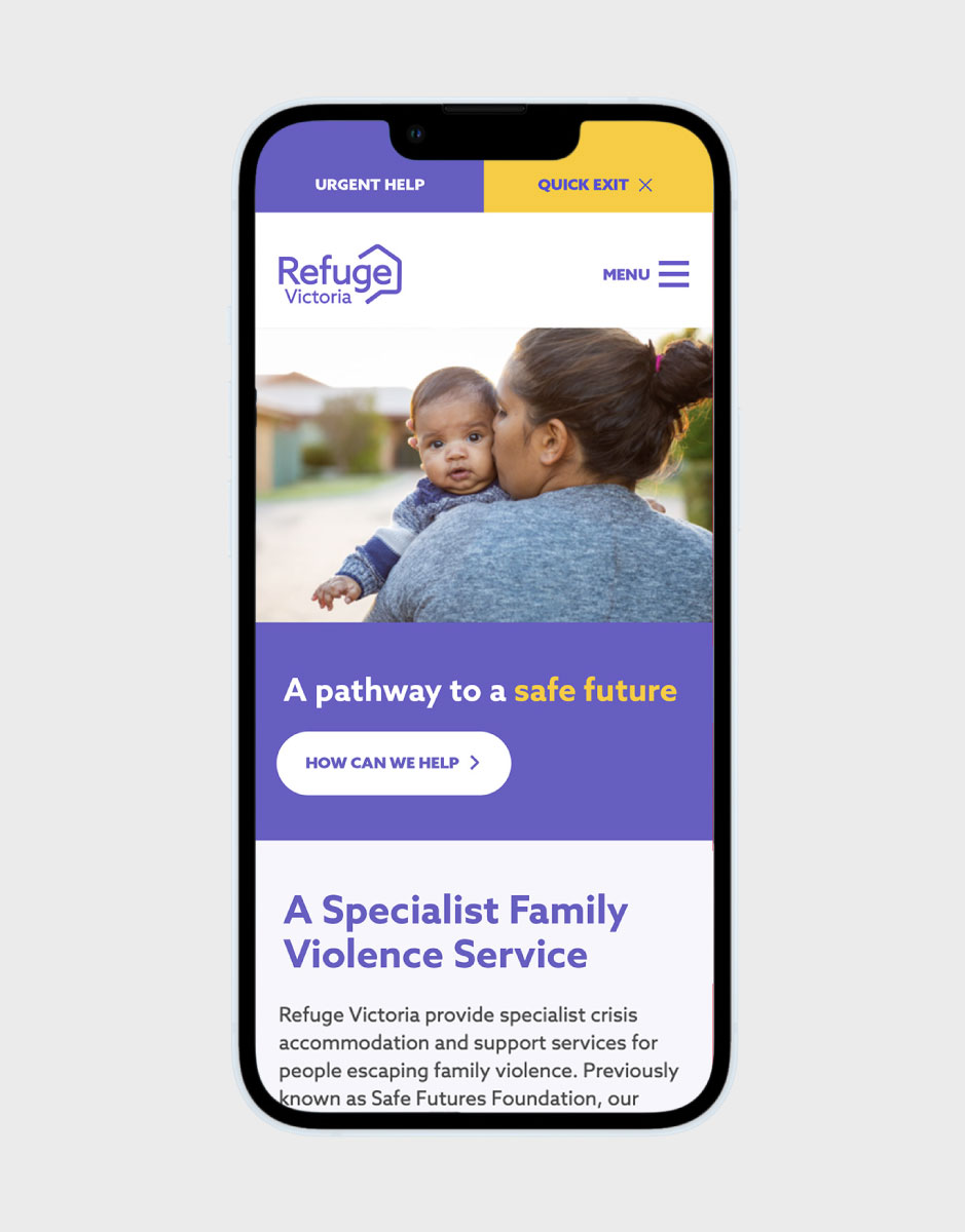
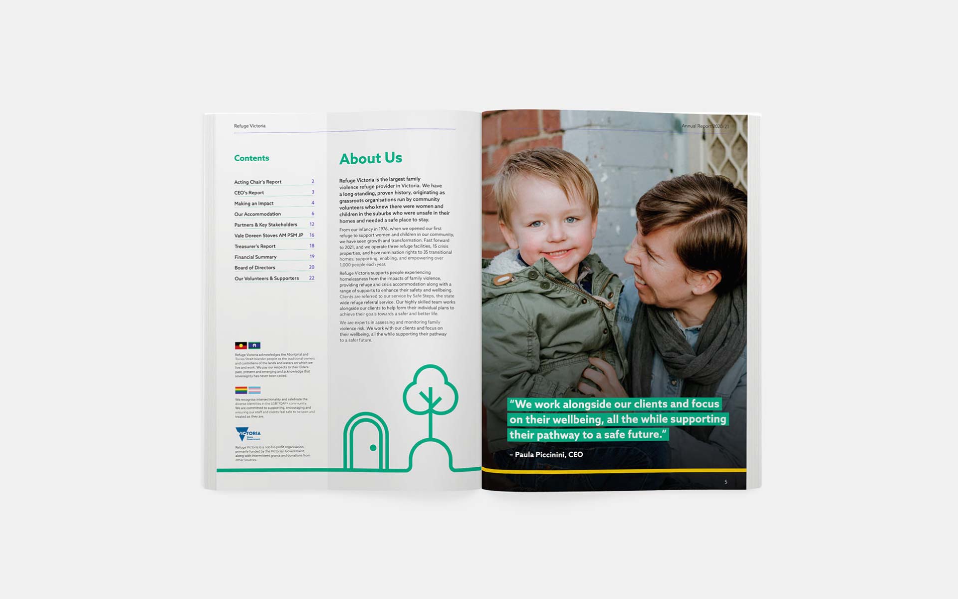
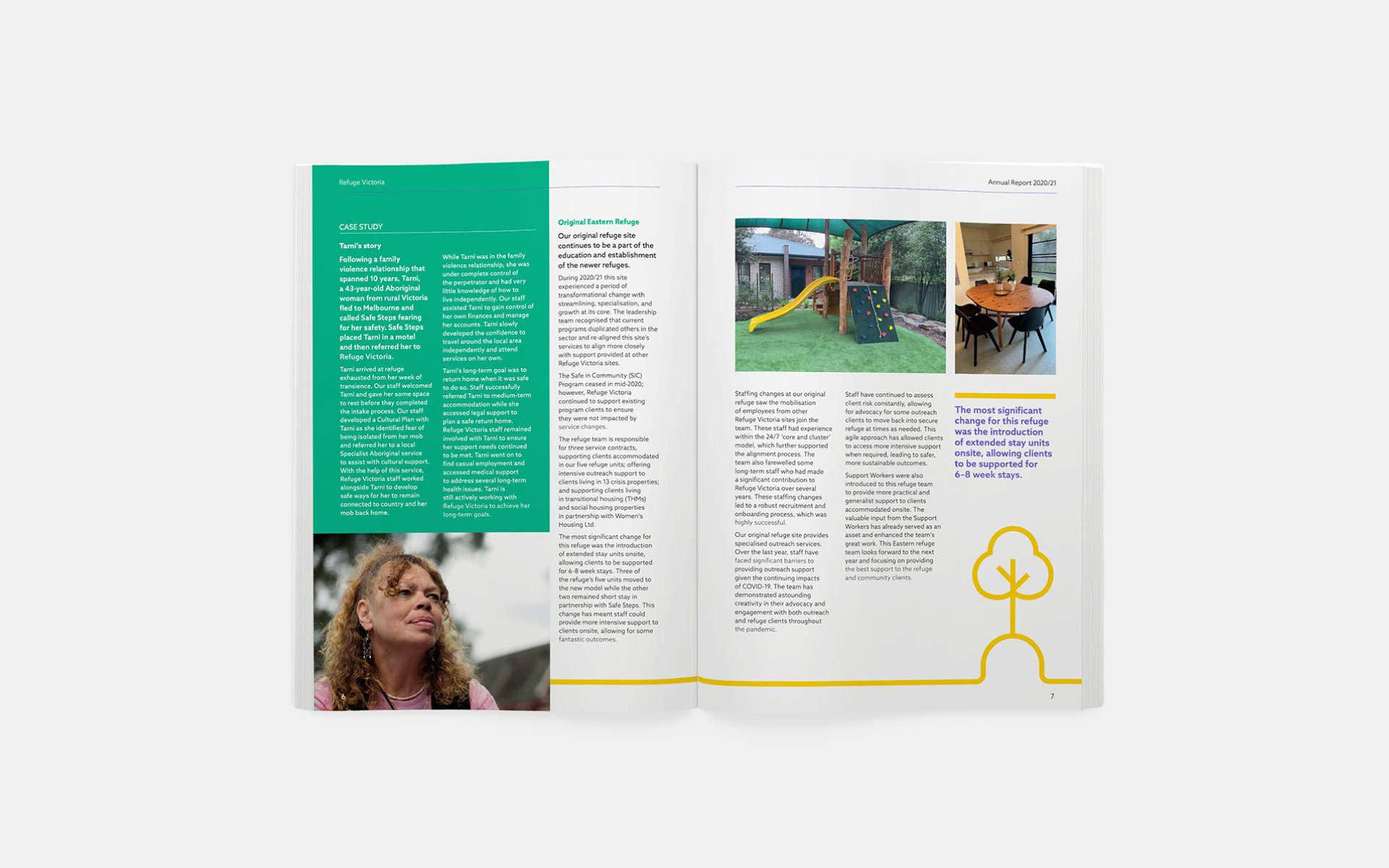
Refuge Victoria provide specialist crisis accommodation and support services for people escaping family violence.
The brief
After the findings of the Royal Commission into Family Violence, Refuge Victoria underwent an organisational-wide restructure. They deemed this an appropriate time to rebrand in order to align with their new business strategy.
They wanted the new brand to help facilitate a clarity of purpose and lead to real cultural change that would be instilled across all touch points of the organisation.
The strategy
Through multiple workshops with both staff and stakeholders, we identified a number of insights and developed a strategy that distilled the organisation’s purpose, vision, mission, personality and unique proposition.
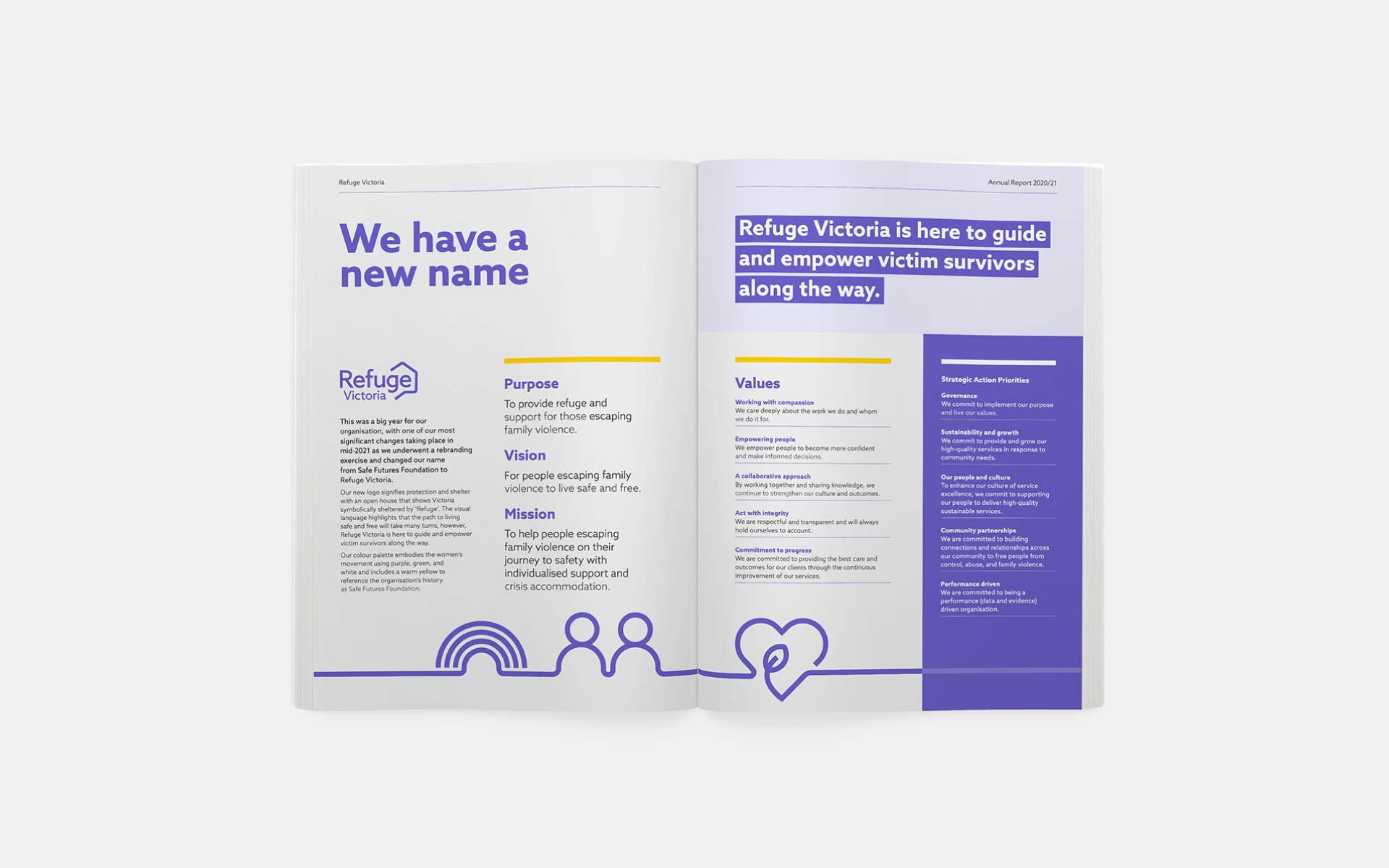
We also conducted naming workshops and research to develop a new name. Refuge Victoria became an obvious choice as it captured both the service offering (refuge being a term particular to domestic violence) and the geographical context (the largest provider in the State).
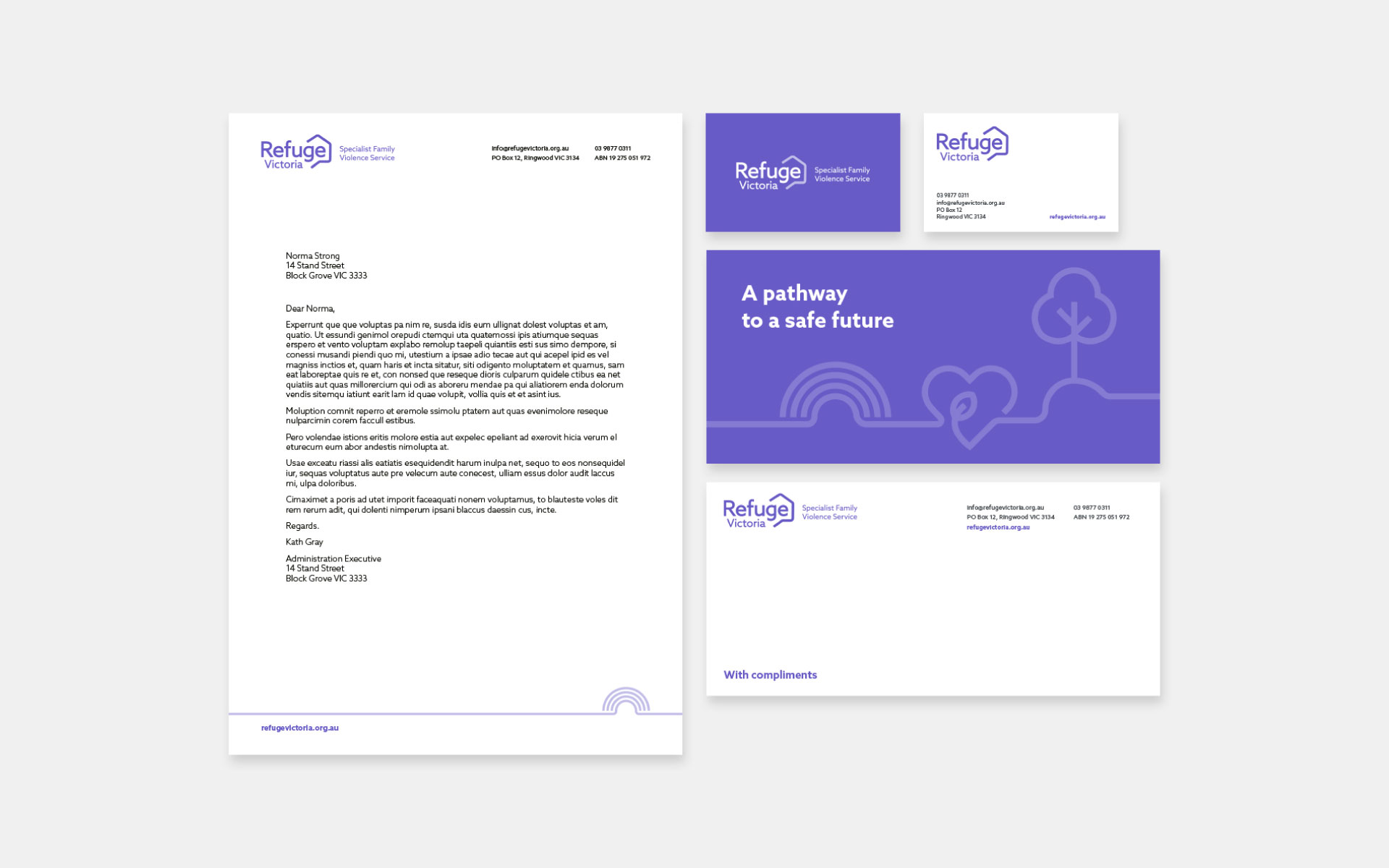
The brand
The brand needed to look professional, have longevity and pay homage to their origins of the Women’s Liberation Movement. It need to appeal to both those seeking refuge as well as linked organisations seeking information.
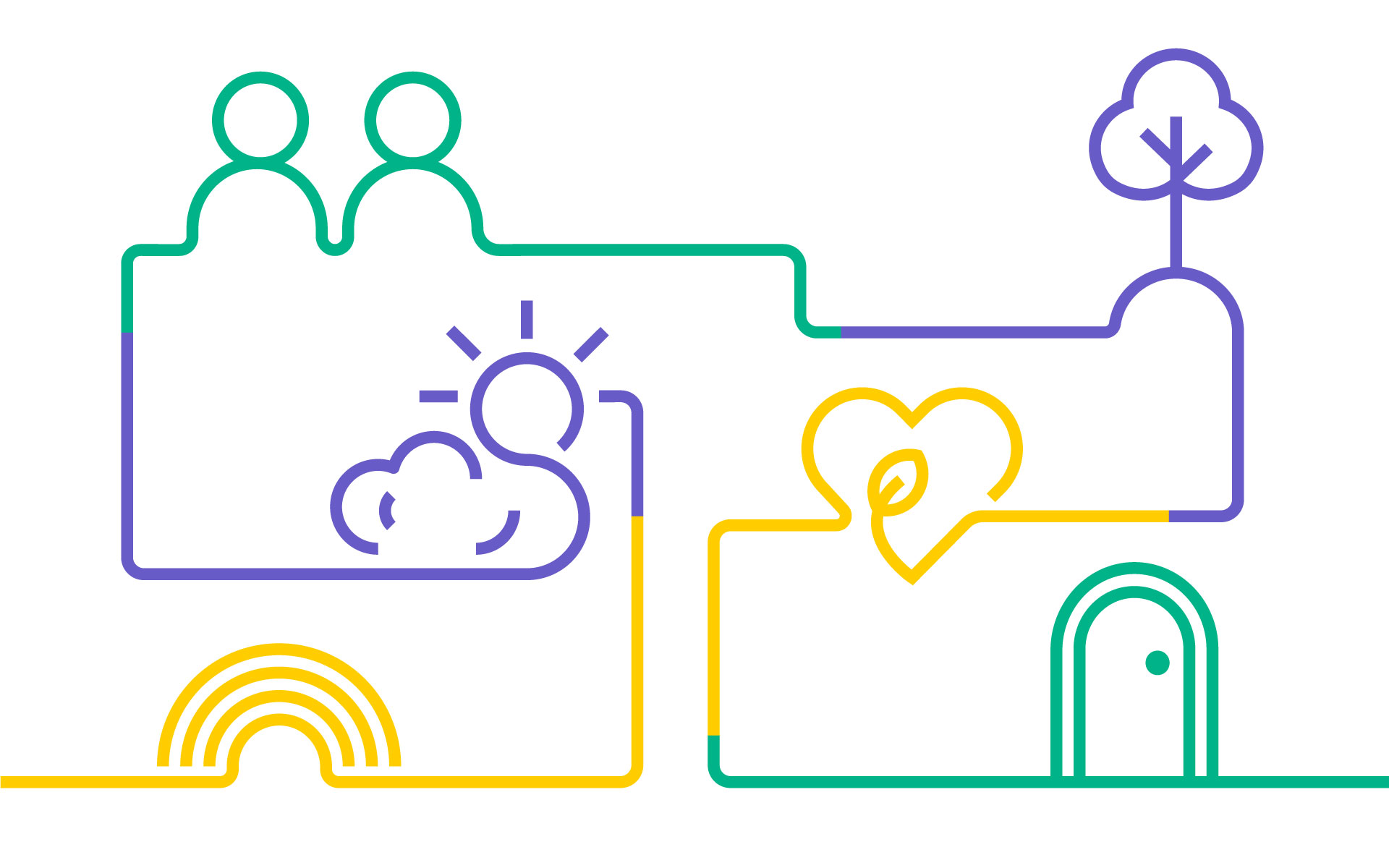
The resulting logo signifies protection and shelter with an open house that shows Victoria symbolically sheltered by ‘Refuge’. The new brand’s colour palette of purple, green and white reflect the Women’s Liberation Movement.
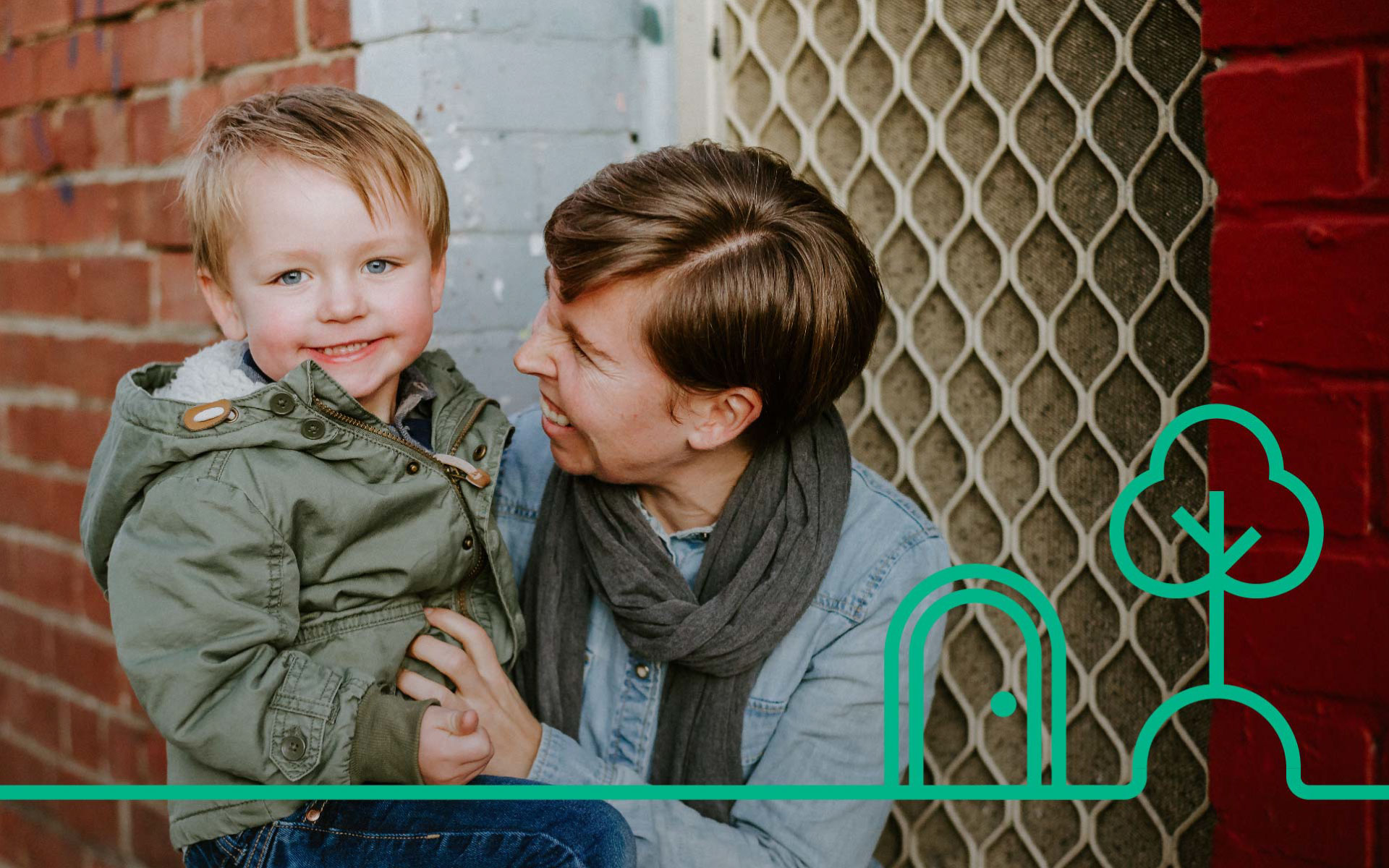
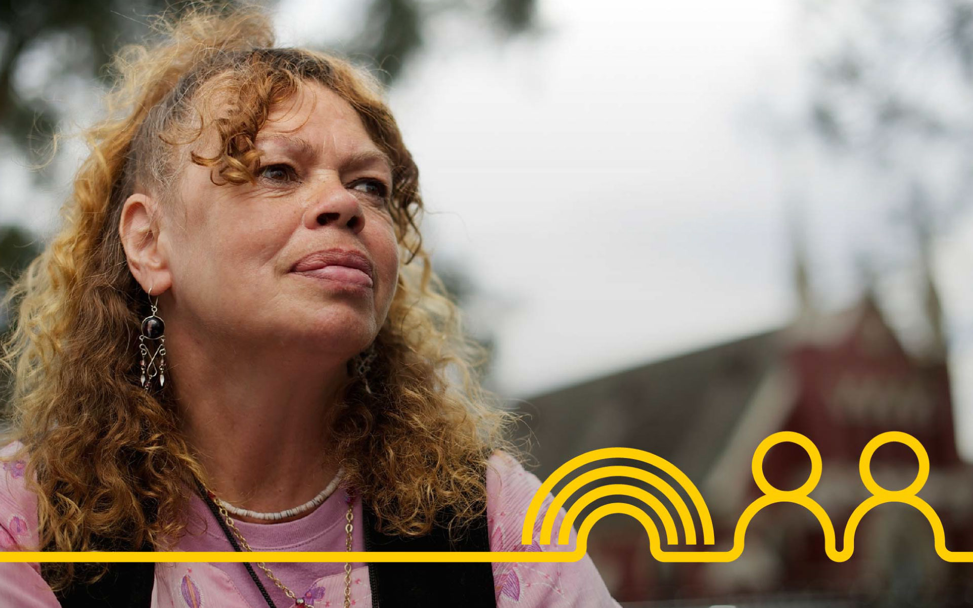
The illustrated line work that carries through the visual language highlights that the path to living safe and free will take many turns however Refuge Victoria is there to guide and empower survivors along the way.
Outcomes
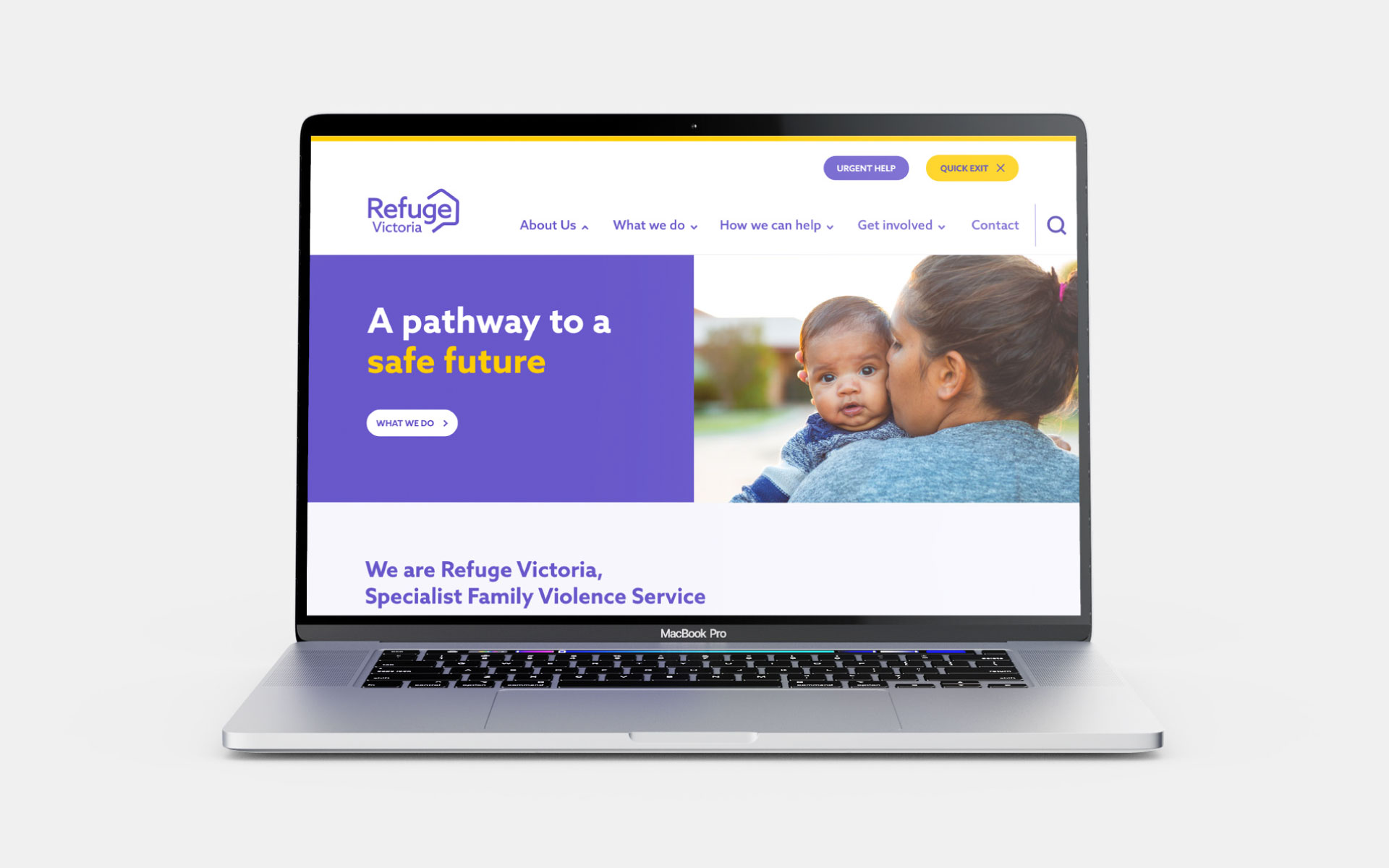
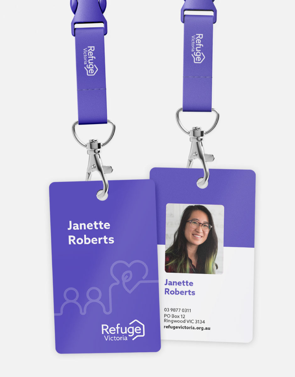
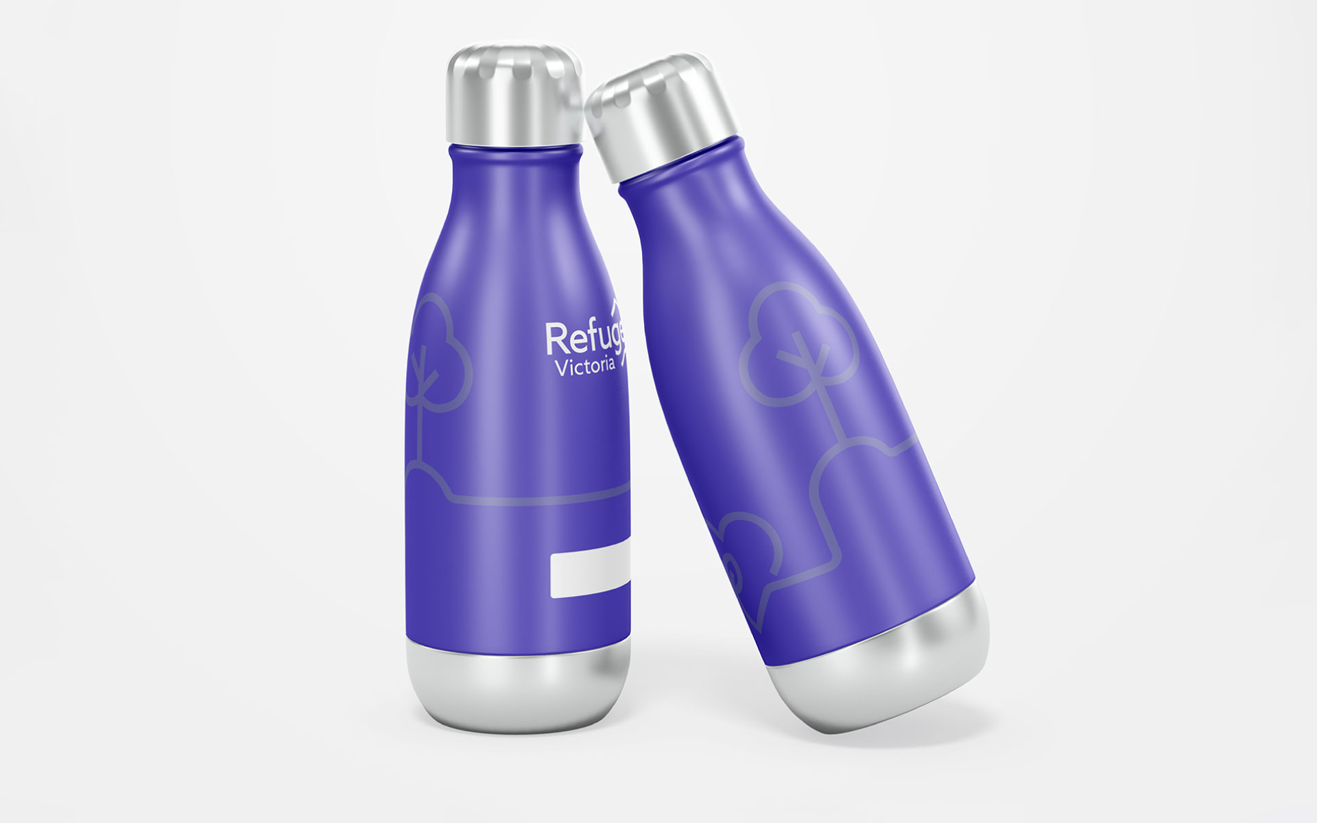
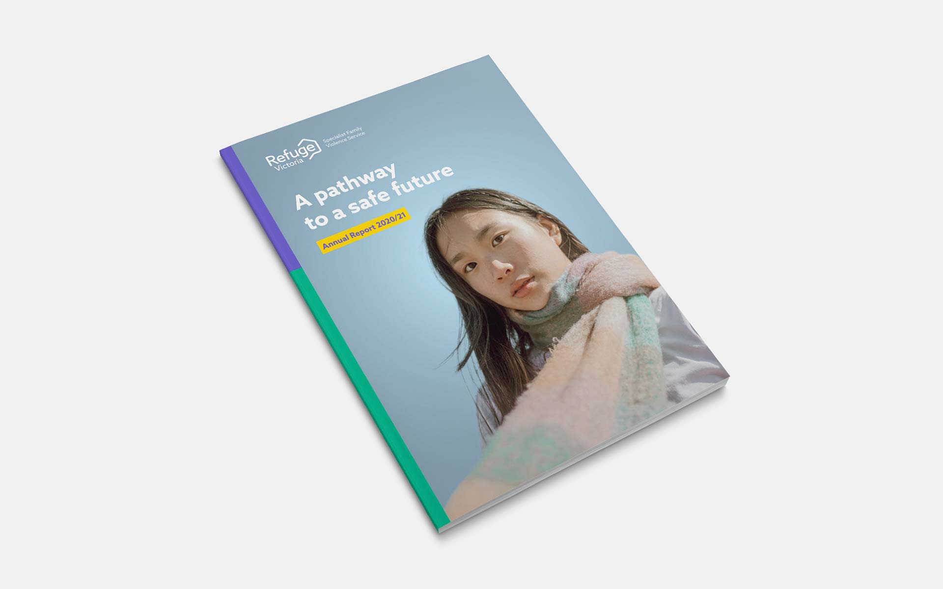
The brand was applied to all communications touchpoints of the organisation. This included the design of stationary, launch material, signage, flyers and (most notably), the design and development of a responsive website.